Visualization using Highcharts
Highcharts introduction
Highcharts is a javascript library which is very popularly used to create data visualizations. The main objective of using highcharts is to visualize our sentiment results for different gulf airlines.
We’ll first separate our tweets based on the airline and find out the sentiment distribution for each airline. We will then use bar chart to visualize our sentiment results.
1. Preparing data for visualization
We first need to filter the tweets and their generated sentiment by airline. So we scrap tweets by airline name from the sentimentUniqueTweets.csv file.
Save the following script as scrapAirlineTweets.py and run the script once and run again by editing thescrapTweets("qatarairways")by using emirates and etihadairways.
The script will generate individual files containing tweets about each airline.
'''
scraps and stores tweets by airline
'''

import csv

sntTweets = csv.reader(open("search-data/sentimentUniqueTweets.csv", 'rb'))

def scrapTweets(airline):
    airwayTweet = csv.writer(open("search-data/"+airline+"Tweets.csv", "wb"))
    # store tweets by airways
    count = 1
    for row in sntTweets:
        r = row[2].lower()
        r = row[2].strip('#').strip('@')
        if airline in r:
            count = count + 1
            airwayTweet.writerow(row)
    print "# of rows", count

scrapTweets("qatarairways") # replace with emirates and etihadairways and run this script again
Now we need to calculate the number of tweets which were positive, negative and neutral for each airline. This is to find the statistics of the sentiment results generated.
Save the following script as computeResults.py and run the script to compute results.
The script when executed, generates results.csv, containing total, positive, negative and neutral number of tweets for each airline.
'''
compute total, positive, negative and neutral tweets for each airline
'''

import csv

def getStats(s, fileRead):
    tot = 0;
    pos = 0;
    neg = 0;
    neu = 0;
    for row in fileRead:
        tot = tot + 1;
        if row[4] == "positive":
            pos = pos + 1;
        elif row[4] == "negative":
            neg = neg + 1;
        elif row[4] == "neutral":
            neu = neu + 1;
    print "Tweets Stats for", s
    print "total tweets: ", tot
    print "positive: ", pos
    print "negative: ", neg
    print "neutral: ", neu
    results.writerow([s, tot, pos, neg, neu])

qatarTweets = csv.reader(open("search-data/qatarairwaysTweets.csv", "rb"))
emirateTweets = csv.reader(open("search-data/emiratesTweets.csv", "rb"))
etihadTweets = csv.reader(open("search-data/etihadairwaysTweets.csv", "rb"))
results = csv.writer(open("search-data/results.csv", "wb"))

getStats("qatar", qatarTweets)
getStats("emirates", emirateTweets)
getStats("etihad", etihadTweets)
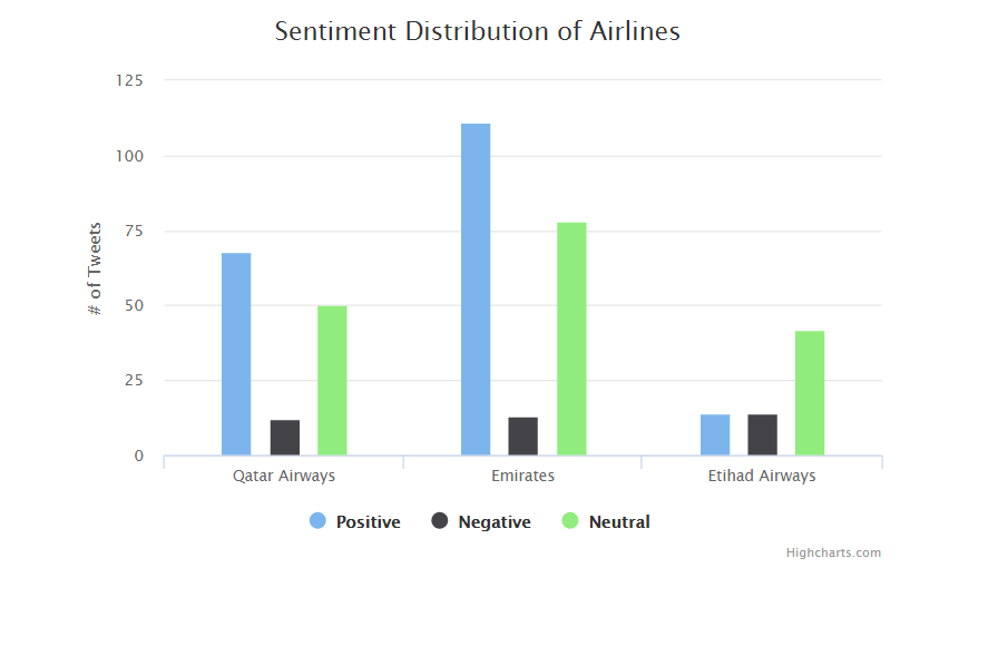
The results.csv will have the data in following format:
2. Visualizing sentiment results using Highcharts
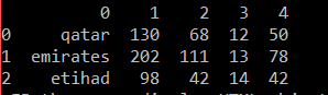
Now to visualize the results, we use Highcharts javascript library. Highcharts have different types of charts, asdisplayed here. We will implement a basic grouped column chart - found here.
Download jQuery from https://code.jquery.com/jquery-3.1.1.min.js
Download the highcharts javascript library from http://www.highcharts.com/download. Click on Highcharts 5.0.7 to download
Extract the library and copy paste the highcharts.js file from code folder.
The jquery and highcharts javascript files should now be copy pasted inside lib (new folder) of your project folder.
Create a new file results.html and save the following code.
Locate the results.html file and double-click on the results.html file to execute it using your desired browser.
You will see a column bar chart like below in your browser: